Microsoft Excel: Using Conditional Formatting To Make Heat Map

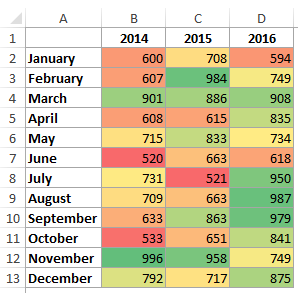
A data set’s comparative view can easily be represented visually with the aid of a heat map. For instance, the red cells in the dataset below shows the period when there were low sales.
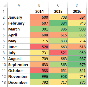
The colors are relative to the cells’ values. The green-colored cells have the highest values, followed by the yellow and the red has the least values.
Using conditional formatting to make a heat map
It is possible to make a heat map by highlighting the points in a dataset manually. The colors will however not change with a change in the cell’s value. If you want the color of the cells to change with a change in value, then you would have to use conditional formatting.
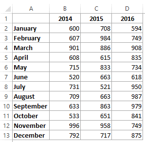
Imagine you have this set of data:
To use the above data to make a heat set, follow these steps
-
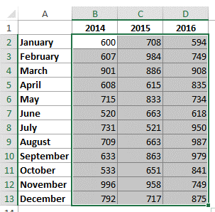
Highlight the set of data
-
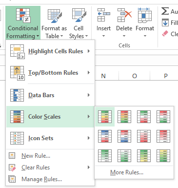
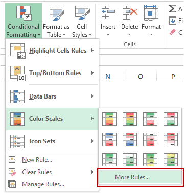
From the home tab, select conditional formatting and then color scales. There are many combinations of colors with which the colors can be highlighted. The initial color scale is however the most popular one where the big values have agreed shade and the smaller numbers have a red shade. It is possible to see a real time preview of the color scales by just moving the mouse over them.
You will get this result
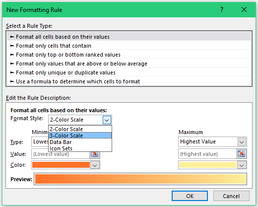
This however shows the values in a gradient. It is however possible to have just a shade of red, yellow and green to show the colors. To achieve this, you have to specify the set of values for a particular color, for instance, you could say below 200 is red, between 201 and 400 is yellow while above 400 is green. Based on this, you can use the more rules option under the color scales menu.
You can then change the format style and value.
Microsoft Excel: Making a heat map that is dynamic
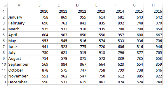
Using the set of data below, it is possible for there to be a change in the heat map as the year is changed with the scroll bar.
-
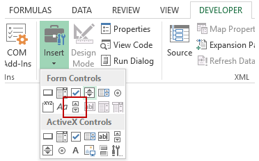
From the Developer tab, select control, then insert and then scrollbar. A scroll bar will be inserted in the worksheet once you click.
-
Select format control after right-clicking the scroll bar.
-
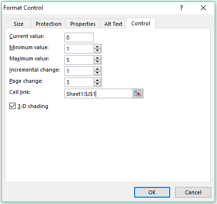
Make the changes shown below in the dialog box for format control
-
Select OK
-
The formula for B1 should read =�INDEX�(Sheet1!$B$1:$H$13,�ROW�(),Sheet1!$J$1+�COLUMNS�(Sheet2!$B$1:B1)-1)
-
Put the scroll bar under the set of data after resizing it.
-
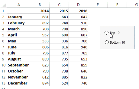
It is also possible to use the radio button to make a heat map as shown below.
Making a Pivot Table Heat Map
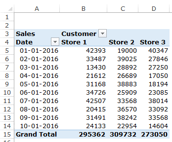
Just like regular data, Pivot Data conditional formatting works in the same way. Using the data below: highlight cells containing the data.
Select the color scale under conditional formatting in the Home tab.

Related Tutorials

The average value of number of cells or a data range in Excel can easily be calculated using AVERAGE() formula.

This new function allow to add handwritten equations to text, so you can add mathematical equations more easily to excel documents. The sketches of the equations can b...

It is possible to copy a pattern of data in a very simple way. The data can be either numbers, text, dates or formatting.


Latest
-
Understanding How HYPERLINK Works In Excel
Excel has a built in function to create hyperlinks &...
-
Understanding how MS Excel Query Works
“Query” in MS Excel has same meaning as ...
-
An Introduction To Excel Power Map
Our today’s post is about “Power Map&rdq...
-
Using Pivot Charts For Displaying Data
Conventional charts are mostly used for displaying r...
-
Using “Calculated Items” For Analyzing A Pivot Table
In our last post, we explored how to use calculated ...