An Introduction To Excel Power Map

Introduction:
Our today’s post is about “Power Map” is by Ben Richardson who runs Acuity Training a London-based provider of Excel courses
Power Map is a MS Excel Add-in that is part of its BI (business intelligence) suite and is used to map geographic data. The term “Power” refers to the family of BI products that have been included in various versions of Excel, starting from Excel 2010 onward.
Power Map is also available as a com-based, separately installable add-in.
Getting Started – Installing the Add in:
Power Map is pre-installed in Excel 2016. This part is for 2013 and earlier users.
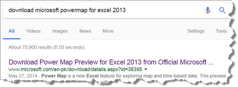
Google “MS Excel Power Map for Excel 2013” and you will find as the number 1 result (probably) the MS web page that you can download the add-in from.

After downloading and installing add-in, you can load it from the add-in menu, as follows:
-
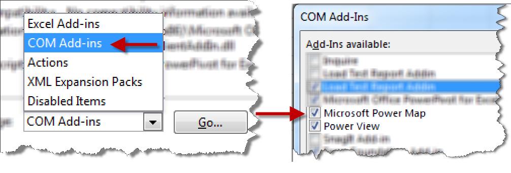
1- Go to File Menu > Options > Add-Ins. You will be offered a number of options.
-
2- On Lower Right side of the dialogue box, select “COM “based add-ins.
-
3- This will display the dialogue box with options to select an add-in. since we have already installed it, it should appear in this list. Select the “Power Map” Add-in and press OK.
-

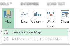
After installation, the power map ribbon will appear in the “Insert” Tab.

Getting and Preparing Data to be plotted:
If you have your own data to plot, that is great. If you are practicing using this feature Microsoft offers a number of databases of data that you can use.
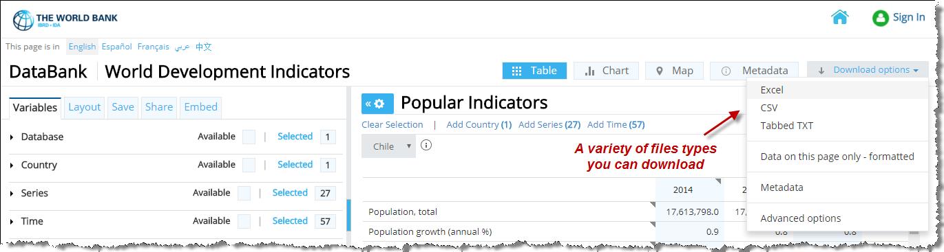
For this tutorial, we will be using data from the World Bank Database. You can download the one used in the tutorial from this link[1]. .
You can download the data as an Excel file, in CVS or text file format. For a beginer, it is best to download the Excel version of the file.

Lets start by developing a simple model. We will then see how the options available will improve it for us. .
We will use the European data from the file we downloaded, modified to be used with this tutorial.

Senario # 01 – Plotting The Population Of EU Countries In the Year 2000:
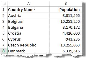
The data for the population of the EU is available in the accompanying file – the data for this scenario is available in the sheet named “Senario 1”.
In order to make a Power Map:
-
1- Select the entire data set.
-
2- Go to Insert > Power Map > Launch Power Map
Excel will now open an entirely new window with a world map in the center and with a number of options available on the right and above the map, as below:

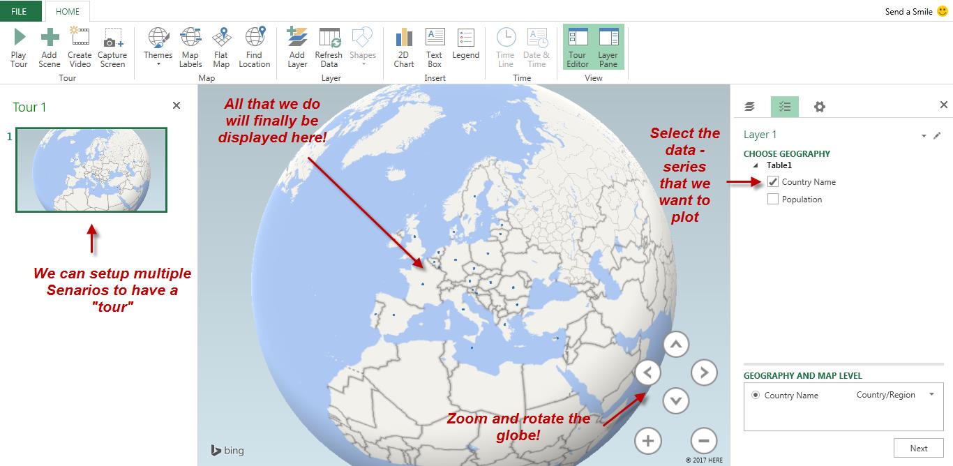
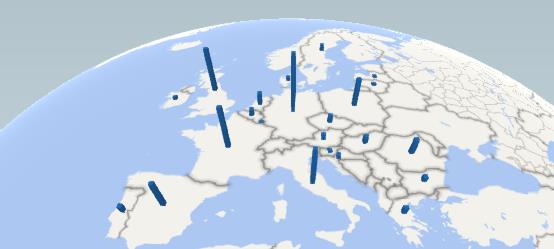
We can see a very basic plot on the globe. If we zoom in, we can see further details but what we are looking at right now are just the “Geographic Indicator” in our database or merely “countries” represented by spots.
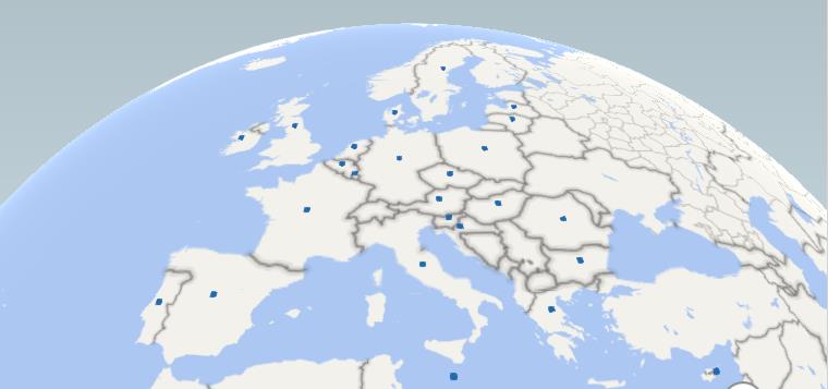
Let’s take a look at how it looks when we zoom in (using the controls in the bottom right of the map window):

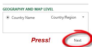
To add the population to this map, we will click “Next” in the bottom right of our Excel screen, see screen shot above.
This will take us to a screen where can add attributes or variables by geography:

If we select “Population”, it will be shown on our Power Map.
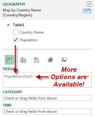

The height of the bar for each country now represents the size ofit’s population.

Let’s now explore some of the other options available for this plot.
Adding Country Name to the “Category”:
-
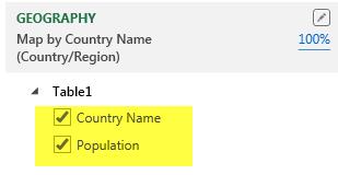
1- If we enable (tick mark) the “Country” variable it will be added to the “Category” section of the Power Map Options.
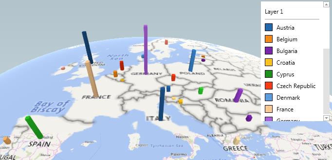
This addition will be displayed by each country having a differently coloured bar on the map. This isn’t very helpful without a guide to what each colour represents.

-
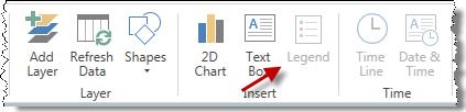
2- In order to clarify this, we need to enable “Legends” from the options in the ribbon to identify the country by the color of it’s column. See the ‘Layer 1’ list in the image below.
-

-
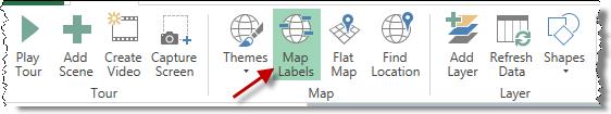
3- Another option is to enable the “Map Labels” to see the name of each country, just below the bar representing its population. This is also shown below.
-

The final output is:

Scenario # 02 – Plotting Multiple Years:
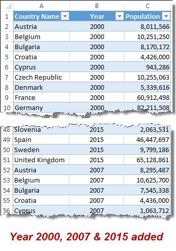
If we need to show data for three years we will need to add the corresponding data sets for 2007 and 2015 to the exisiting data for 2000.
The final data will be in the format below:

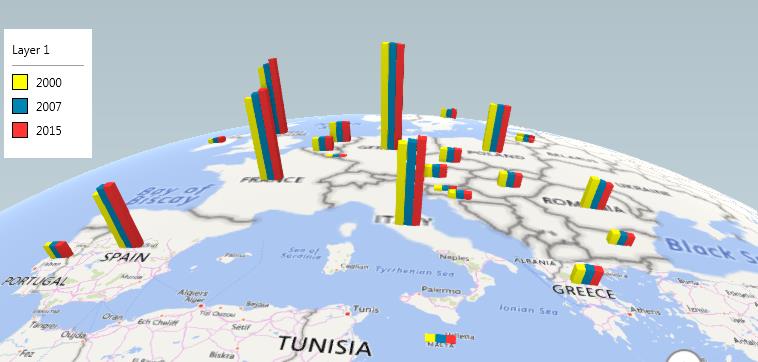
We will now need to select the clustered column chart to plot the data for years side-by-side:


This will how the final result as below.

Conclusion:
This introductory article can only give an initial view.
Power Map contains a huge number of possible ways to represent your data - for example we can save individual scenarios and produce a tour, create time lines, add layers, plot a map in 2D instead of 3D and so on.
We’re planning to produce this shortly.
[1] The link for downloading raw data (as accessed on 11 Sep2017) is: http://databank.worldbank.org/data/reports.aspx?Id=d1e72bda&Report_Name=Popular-Indicators#

Related Tutorials

Shortcut to include today Just press control key and semicolon (Ctrl + ;) in any cell, enter. This will enter today’s date in to the cell.

Excel is a life saver at work and there is always a free online training for Excel in the internet. At Sheetzoom, we offer free excel...
Check out the What's new in Excel 2016 for Windows(Infographic) to know about:


Latest
-
Understanding How HYPERLINK Works In Excel
Excel has a built in function to create hyperlinks &...
-
Understanding how MS Excel Query Works
“Query” in MS Excel has same meaning as ...
-
An Introduction To Excel Power Map
Our today’s post is about “Power Map&rdq...
-
Using Pivot Charts For Displaying Data
Conventional charts are mostly used for displaying r...
-
Using “Calculated Items” For Analyzing A Pivot Table
In our last post, we explored how to use calculated ...