Using Pivot Charts For Displaying Data

Conventional charts are mostly used for displaying rather “static” data from excel sheets – i.e. if you have a table where you have manually entered data and you want to make a chart, go for the conventional excel chart. But if you have data in a list, have created a pivot table, you will have to go for pivot charts instead.
Pivot charts provide same flexibility of use as do pivot tables. We can drill down the chart, select and deselect variables and so on. We can modify chart to our aesthetics and select between chart types. We can format gridlines and markers, add trend lines, plot series on secondary axis – all with flexibility of pivot table in the background.
In this short tutorial, we will show to insert a pivot chart and format it using various available options. Let’s take up an example and move forward.
We want to plot sales of Items on a chart.
We will point to Tab Insert > Pivot Chart and we will have a blank pivot table as well as pivot chart. As we drag the “Total” and “Units” to Value area and items to row label, we will have following pivot table and pivot chart.
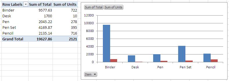
We can see that there is an option of drop down in for item to be selected the bottom left corner of the chart. This is enabling us to select what we want to display on the chart.
This is just a basic chart, we will see how we can modify this chart to suit our needs.
Formatting Grid Lines
As a rule of thumb, there must be no vertical lines in the charts. For the default chart, the horizontal lines are too thick or dark and we can remove them or modify the color as follow:
-
Deleting Grid Lines:
-
Select the grid lines.
-
Press delete
-
-
Changing color of gridlines
-
Select gridlines.
-
Right click, select Format Gridline, you can change
-
Color of lines
-
Style of lines
-
Few more options that you can play with
-
-
Here is how chart looks like when we delete the line:
Formatting Data Series
Data series can be formatted just like we did gridlines. In order to change the color or look of chart:
-
Select data series
-
Right click, Format Data Series and you will display a bunch of options to change format
-
Separation between different series (since ours is a bar chart)
-
Fill color options
-
Line color options
-
Line Style options
-
Few more options related to formatting data series.
-
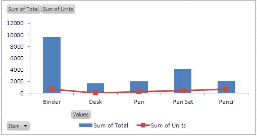
Plotting a combination chart:
A combination chart is a chart produced with two different chart types. For instance a chart with bars and a line chart plot is a combination chart. These charts are produced to different between data types – for example sales and units are two entirely different variables we can plot sales on bars and use line chart for units.
In order to do so, select the series “Unit”, Right Click and select Change Series Chart Type. This will display the dialogue box for chart selection, select the line type with markers and press ok. The following chart will be displayed.
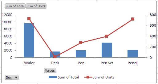
Plotting Data Series on Secondary Axis:
You can see the difference in values of sales and units, and the corresponding difference in the heights of the two fields. One might find it difficult to analyze the units on a much larger scale suitable for sales. We can plot this series on the secondary axis. This will add a scale that will be according the range of units sold.
For adding secondary axis:
-
Select the data series – units
-
Right click, select format data series
-
Under Series Options, select plot on secondary axis
-
Press ok – you are done.
The series will be added to the secondary axis.
Conclusion:
Pivot charts come with many options to change their format according to our requirement. They have also benefit of behaving like a pivot table as against an ordinary chart. Please download the sample file to see how it works.

Related Tutorials

You must have used filters in Excel! Whether you are using a table or have a list, whenever you have data and want to search for certain information
Consider a case where you have a table like below and want to fetch the data for a single month.
When you have some data columns that you don’t want to display can be hidden from the sheet.


Latest
-
Understanding How HYPERLINK Works In Excel
Excel has a built in function to create hyperlinks &...
-
Understanding how MS Excel Query Works
“Query” in MS Excel has same meaning as ...
-
An Introduction To Excel Power Map
Our today’s post is about “Power Map&rdq...
-
Using Pivot Charts For Displaying Data
Conventional charts are mostly used for displaying r...
-
Using “Calculated Items” For Analyzing A Pivot Table
In our last post, we explored how to use calculated ...