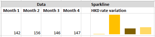
Displaying Large Data Sets With Sparkline In Excel

Our paper is designed to accommodate two-dimensional charts, or at best 3 dimensional charts. But those charts are produced at the expense of understandability and appearance of them. What if you want to produce so many to them to accommodate cross-tabbed data?
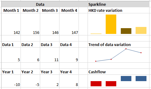
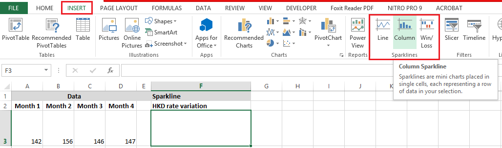
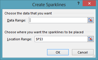
The feature that comes handy for such situation is “Sparkline”. This feature is introduced in Excel from Excel 2010 and can be accessed through Insert > Sparklines or you can use shortcut key Alt+N+SL or SO or SW for Line, Column and Win/Loss types respectively.
Let’s take up an example and see how can we use them to accommodate large amount of data in small space in an excel sheet.
Situation 1: Case of Variation in Weight of a production.
“Mr. Alen has data for variation of weight for his a tooth paste that his factory produced. His factory has 2 production lines 3 products. The data is available for the month of March 2016. He has to present this data to the top management to discuss the weight variation problem, How will he do that?”
The solution is to produce a Sparkline that works on the data like below. The formatting options are used to set show the Max and Min points on the data.
In order to make the scale of the diagram same for all the spark lines we need to set certain options accordingly. Here we have set the Vertical Axis Maximum and Minimum column for all to be the same. Thus ensuring that apparent scale of the data is the same.
An even better view of data can be achieved by using a just showing pots and not displaying data like in following screenshot:
There are still variations that are possible to be done with Sparklines, let’s see following example of temperature in a test lab that has both negative and positive values.
Situation 2: Data for Temperature with both negative and positive values
Sparklines are quite capable of displaying negative values and positive values as well. The following example shows how negative temperatures are highlighted. Here we can also set the max positive and maximum negative values.
You can create summaries for variation, record rise and fall in stock prices, cross tab data and all that within a very small space as compared to the conventional chart in Excel. Please see the attached file for ready-to-use examples.

Related Tutorials

You must have come across charts that are overloaded and you find them a pain to read. Yes these are charts that look quite pretty initially but they are read and inte...

One have seen different types of graphics that display information, ranging from simple charts, to dashboards and miniature charts like spark lines and so on, but one ...

Two dimensional lookup is obvious – we have a header row and a column and we want to look at the intersection of the two criteria’s.


Latest
-
Understanding How HYPERLINK Works In Excel
Excel has a built in function to create hyperlinks &...
-
Understanding how MS Excel Query Works
“Query” in MS Excel has same meaning as ...
-
An Introduction To Excel Power Map
Our today’s post is about “Power Map&rdq...
-
Using Pivot Charts For Displaying Data
Conventional charts are mostly used for displaying r...
-
Using “Calculated Items” For Analyzing A Pivot Table
In our last post, we explored how to use calculated ...