Producing Panel Charts In Excel

Data bars are amongst one of the many feature excel has for presenting data. Just like graphs, spark lines and flow diagrams, we can use it to present the data in the form of graphs. In this post we will show you how to use data bars to produce a dashboard like effect in excel and how to produce panel charts with data bars.
As the name suggests, panel charts are charts placed as panels in the sheets. The following figure shows how a panel type dashboard looks like. These panel charts are used to
In this tutorial we will see how to produce a and use panel charts from Excel.
Panel Charts Defined:
Panel charts are charts that show relationships of two or more variables with each others.
Example:
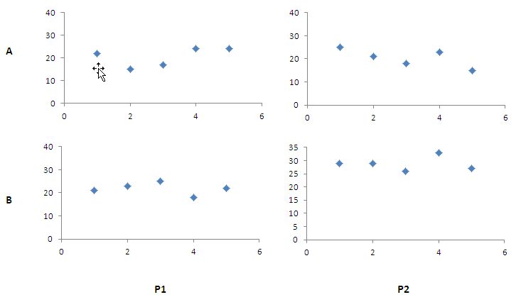
Lets consider the two products P1 and P2 and the sales person Mr. A and Mr. B. we are trying the analyze the relationship of the two factors by plotting them against each other. Let’s prepare the dummy data first and then proceed to plotting chart.
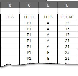
Let’s start by plotting the first set of observations – select the data in the range E3:E7 and go to insert > Scatter Plot > scatter plot with only marks and press ok. Thus you will have first of the four chart.
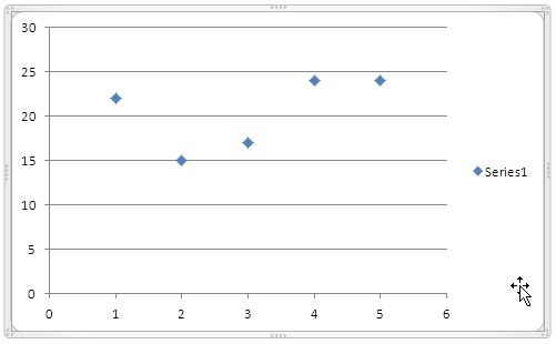
We need to repeat the steps for all the four data sets. Each time we execute, we will have a new chart showing relationship between two respective variables.
 the graph on the right shows how a rough chart would look like.
Once we have all the four charts, we are ready to draw the panel chart now.
Steps to put graphs together to get a panel chart
-
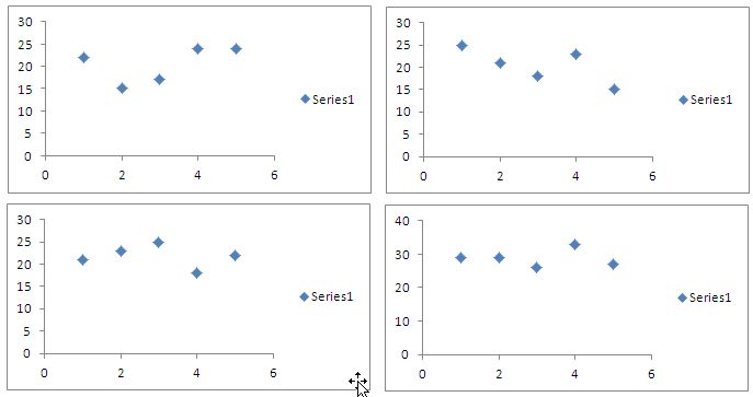
Put all the charts side by size making a 2 x 2 panel on the excel sheet.
-
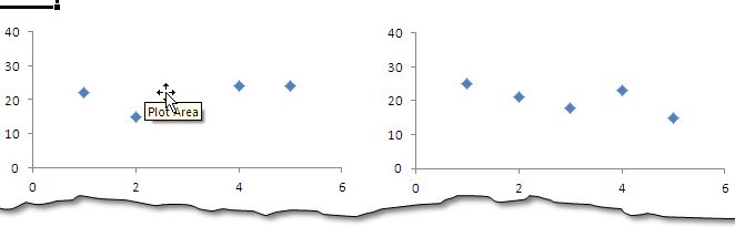
Remove the horizontal lines from the graphs – following is the diagram showing this state.
-
-
Remove the tags – series1 from all the four charts
-
You can see that the values on y-axis on all the charts are not the same. On the chart in the right bottom, y-axis has maximum of 40 so we need to either trim it down or move up the rest of values in the three charts.
-
-
The one final touch is to remove the borders from the chart, all the fours and the final panel chart is ready. You can add the data labels on all the four charts and finish the chart.

Related Tutorials
MS Excel has been used in many diversified areas; one of them is accounts and finance.

Excel has so many functions that either one of their or their combination can fulfill most of the tasks required in our work places.
Excel has recently introduced many new charts in its latest version.


Latest
-
Understanding How HYPERLINK Works In Excel
Excel has a built in function to create hyperlinks &...
-
Understanding how MS Excel Query Works
“Query” in MS Excel has same meaning as ...
-
An Introduction To Excel Power Map
Our today’s post is about “Power Map&rdq...
-
Using Pivot Charts For Displaying Data
Conventional charts are mostly used for displaying r...
-
Using “Calculated Items” For Analyzing A Pivot Table
In our last post, we explored how to use calculated ...