Plotting Trajectory Of Projectile

Have you ever thrown a pebble in water? You must have in your childhood! The pebble follows not a straight line but a parabolic path. Our today’s post discussed how we can plot the path of such a pebble (that is called projectile in physics) in Excel.
We came across projectile in our daily life – be it throwing of a ball, a car falling from a jump-ramp etc. etc. a football kicked by the goal keeper is an example of projectile, so is a bomb fired from the cannon – both follows similar laws in different domains of life.
So what exactly is Projectile?
A projectile is any object that is fired, pitched, tossed, or thrown. The path of a projectile is called its trajectory. The major force acting on a projectile is the force of gravity.
Equations that Govern the moment:
The moment of projectile is governed by few factors and that we need to consider these factors:
-Angle at which the ball is kicked
-Speed with which the ball is kicked
The equation that will work for us is:
Where x is the horizontal distance covered and y is the height of the projectile. We have our velocity in m/s, acceleration due to gravity represented by “g” equal to 9.8 m/s2 and angle in degrees.
Setting up the sheet:
We need to setup cells for inputting variables:
1- Initial Velocity
2- Angle
3- Distance along X-Axis i.e. values of x
Excel Functions to be used
We will be using Trigonometric function from Excel:
- �TAN�()
- �COS�()
- �RADIANS�()
�TAN�() and �COS�() functions are used to compute specific trigonometric ratios where as �RADIANS�() is used to convert degrees to radians - as the excel functions take values in radians.
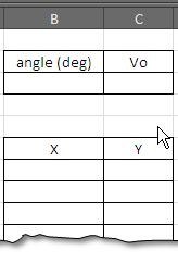
The mathematical formula when converted to Excel formula becomes:
=B7*�TAN�(�RADIANS�(angle))-((9.8*B7^2)/(2*velocity^2*�COS�(�RADIANS�((angle)))^2))
Where the cell B7 contains the value of X, and downwards. The values when put into specific cells give the following result. (see figure on right side).
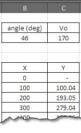
Plotting the data to get the chart.
The last step is to have a graph showing the data. We are interested here in scatter plot that shows values of y over x.
Simply select the data and go to ….
Insert>Chart>Scatter Plot>Scatter Plot with smooth Lines and markers…
And press Ok.
Initially the graph will look like which is not very impressive, but we change it to look like on the right side by making following tweaks.
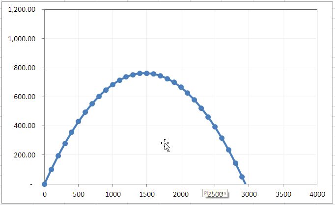
Adjust the lines to dim colors, make markers smaller and round and fix the scales on x and y axis according to your taste to get the chart on right side.

Related Tutorials

Have you ever used the MOD function in Excel? Well, the function actually performs modulo operation.

You must have used filters in Excel! Whether you are using a table or have a list, whenever you have data and want to search for certain information

You must have come across charts that are overloaded and you find them a pain to read. Yes these are charts that look quite pretty initially but they are read and inte...


Latest
-
Understanding How HYPERLINK Works In Excel
Excel has a built in function to create hyperlinks &...
-
Understanding how MS Excel Query Works
“Query” in MS Excel has same meaning as ...
-
An Introduction To Excel Power Map
Our today’s post is about “Power Map&rdq...
-
Using Pivot Charts For Displaying Data
Conventional charts are mostly used for displaying r...
-
Using “Calculated Items” For Analyzing A Pivot Table
In our last post, we explored how to use calculated ...