Excel Charts And Logarithmic Scales

Graphing collected data makes the interpretation of the accumulated information much easier to read, comprehend, and share with others. This is why when a large amount of numerical data piles up, you will most probably end up plotting the data on a graph and end up formulating a skewed graph or chart such as the one depicted below:
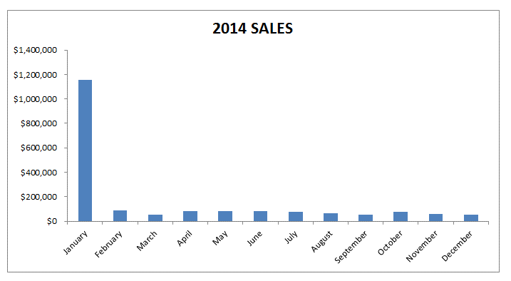
When you are plotting the data in Microsoft Office Excel, you will notice that Excel sets the maximum and minimum scale values for the vertical and horizontal axis by default when you are creating the chart. This is why when you are working with logarithmic scales or a log scale, you should keep in mind that you are allowed to scale your chart from the Format Axis dialogue box by a base of 10 based on your needs and preferences. By doing this, you are automatically allowing the system to multiply the units of the vertical axis by 10. It begins at 1 and gradually increases up to 1000000 etc...
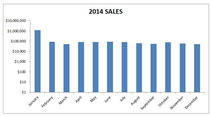
The use of logarithmic scales in graphs and charts when using Excel has become very common, because not only do they respond to the skewness towards larger numeric values such as when some or one of the points are much larger as compared to other data plotted on the chart, but they are also known to assist in showing percentage changes and numerous other factors.
You can even change the values and numbers of the Y and X axis on the charts in Excel to fix your preferences based on the data that you are plotting and ranges of the data. The chart below has been scaled to show a more even spread of the plotting of data by using the logarithmic scale.

Related Tutorials

Many of the learners at Sheetzoom.com are willing to learn VLOOKUP function. It is an amazing and useful tools and learning to use it is much easier t...
Whenever you come up with a useful sheet, it is almost always essential to get it printed. Be it a simple sheet or complex business model, we can not deny the importan...
Excel sheets can surely make your work a lot easier. Undoubtedly, excel sheets is one of the professional tools for working with information ava...


Latest
-
Understanding How HYPERLINK Works In Excel
Excel has a built in function to create hyperlinks &...
-
Understanding how MS Excel Query Works
“Query” in MS Excel has same meaning as ...
-
An Introduction To Excel Power Map
Our today’s post is about “Power Map&rdq...
-
Using Pivot Charts For Displaying Data
Conventional charts are mostly used for displaying r...
-
Using “Calculated Items” For Analyzing A Pivot Table
In our last post, we explored how to use calculated ...