Creating Histogram With Analysis Tool Pack

One of the best ways to find how your data is behaving is to plot a histogram. Creating histogram is amongst the firs step we take to analyze the data as it outlines how the data is distributed, details about the skew-ness and kurtosis (described later in this section).
Excel provides us with a tool called Data Analysis Tool pack that had handful of options for analyzing data. We can create the tool pack to create histograms, though we can also create them from conventional chart and using formula – analysis tool pack provide us ease of use and variety of options for the output.
So first we will take up the example and see how we need to setup the sheet and then will elaborate the use of options in it.
Setting up the sheet:
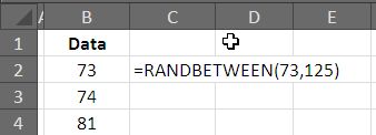
Creating data: As has been our practice, we will be creating dummy data using formula �RANDBETWEEN�() and use it for further analysis. The �RANDBETWEEN�() function takes two arguments, listing the start and the end point of the data. For the sake of our example, lets assume data defined by �RANDBETWEEN�(73,125).
Drag down the formula till you have some 100 values, copy and paste special as values so that we get rid of the formula – otherwise, the values will keep changing due to volatile nature of formula.
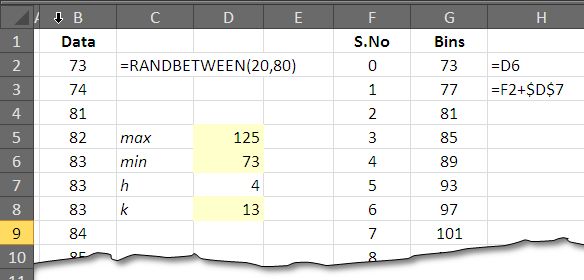
Describe Bins: The bins are intervals in which you want to divide your data. Three are number of options how many bins you can have but here are the two rules of thumbs that you can follow:
Calculating intervals with Range take the difference of the maximum and the minimum value and divide the result by the interval height you want. Mathematically:
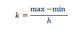
If we take this approach, the maximum for our data is 73; where as the minimum of our data is 125. Thus the range or the difference is found to be 52. If we want height to be 4, we will divide the difference with 4 that will give us 13 intervals for the histogram.
Another approach is to take the square root of the number of observations and gives us the number of intervals, the formulas is thus:

For our case, the number of readings are 100 hence the formulas gives us k = 10.
For our example we will take up the first approach though there is no harm in going for the second one either. The bins once setup will look like following picture:
Creating Histogram with Analysis Tool Pack:
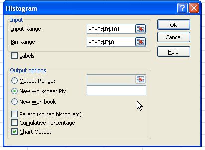
If you have not installed analysis tool pack, please do by going to Addins menu and selecting analysis tool pack, this will give you a logo under tab Data. Clicking the logo will open the dialogue box with the entire test that you can use for the data, select only Histogram.
Options:
Input range is the range where your data is located, for our case it is B2:B101. Bing range is the range where you have created bins, in our file it is G2:G15. If you data has Data Labels to it, you can tick mark the option.
You can specify the location where you want the output to be placed; in that case you need to check mark the options and specify a location in either existing or a new workbook. Besides the two more options, one must have is to have Chart output for the entire process. After this you can press OK to execute the dialogue box.
The output:
As we press OK, the output is displayed in a new worksheet. For our dataset, the out is this.
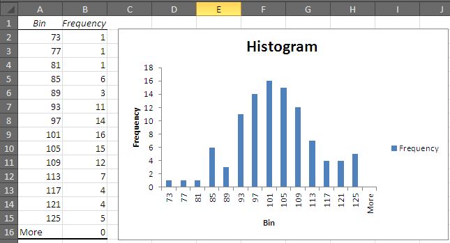
From the diagram, it is evident that the data is though the distribution is normal, but the curve is slightly skewed to right. And there is another rise on the right side of the curve. This is a valuable information and shows that more the data is concentrated towards the upper half of the dataset – more values are to found on the upper side of the dataset.
Please download the attached file for the example sheet.

Related Tutorials

In business, several tools are used to analyze data. One of such tools is the histogram. The histogram is a chart, which has chart columns that signify how frequent a ...

One of the Quora users recently asked a question regarding how to plot lines at the start and the end of a data series.
We encounter this problem of numbers behaving as text with commas when we import data from some other software in to excel sheet.


Latest
-
Understanding How HYPERLINK Works In Excel
Excel has a built in function to create hyperlinks &...
-
Understanding how MS Excel Query Works
“Query” in MS Excel has same meaning as ...
-
An Introduction To Excel Power Map
Our today’s post is about “Power Map&rdq...
-
Using Pivot Charts For Displaying Data
Conventional charts are mostly used for displaying r...
-
Using “Calculated Items” For Analyzing A Pivot Table
In our last post, we explored how to use calculated ...