How To Plot For The Start And End Point On The Graph

One of the Quora users recently asked a question regarding how to plot lines at the start and the end of a data series. The question dragged our attention as it is not usual to mark the start and the end of the lines with markers – but to draw and entire line is a different thing.
So we took up the task and worked out the solution. Let’s see how we can do this in Excel! – What we needed to do is to put a separate line at the start and the end of the actual data. This practically looked like this.
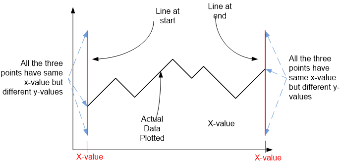
The first important point was to note that the for the start and the end line, we need to have the same x-value for the coordinates as has the first point of the series. This will make sure that the line starts from the start of the series. Same was true for the line at the end of the series – the value along the x-axis does not change for the line but it does for the y-axis – resulting in a vertical line.
We first plotted the data, using a line chart (Insert > Line Chart > Line Chart with Markers) – that results in the following graph:
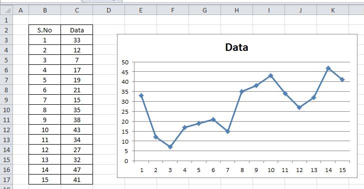
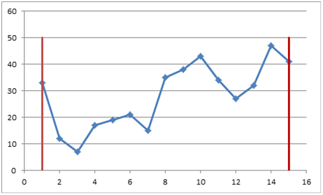
How we can see that the starting point has coordinates (1,33) and the end point has coordinates (15,4) – if we choose to draw at these points, the abscissa of both the lines should be 1 and 15 and the length along y-axis could vary as per our requirement (say from 0 to 50)
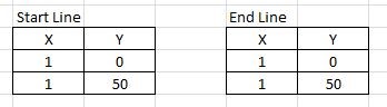
Hence for the starting point we need to plot the following line – (1,0)—(1,50) how will we do that? Will do that by simply adding another series of data to the chart. Before we add the series to the chart we need to add the two tables to the sheet as well, that will list the points to be plotted (see right side figure)
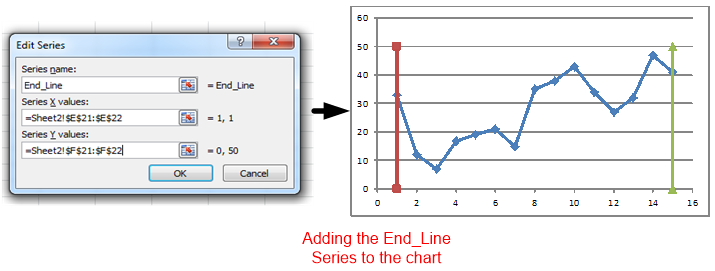
Let’s assume we are adding series named “Start Line”
Select the chart then right click – select Data select Add will lead you this dialogue box
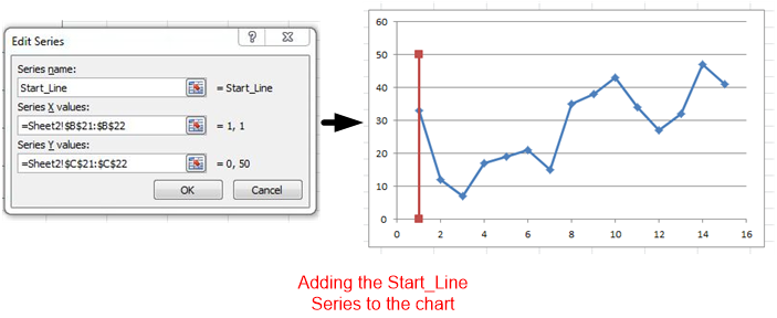
In the same way we can add the end line to the chart – let’s assume the data to be the End_Line, we reach the following stage:
Now these two lines can be formatted to suite our taste:
-
Make color similar – both be the Myron Lines.
-
Remove Markers (Select Series > Format Data Series > Marker Options > None), repeat this for Last_Line as well.
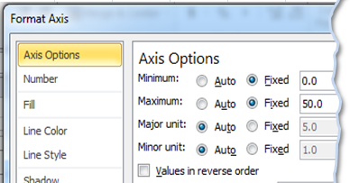
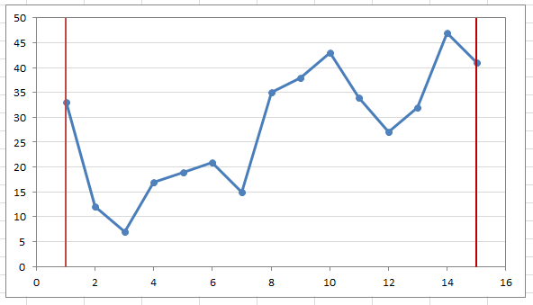
In order to make it look more professional, set the maximum on the y-axis to 50, this will plot line across the height of the graph – select Y-Axis > Format Axis > Axis Options: Minimum set to Fixed & Zero and Maximum also set to Fixed & 50.
Repeating the same for the second series, we reached the following final chart:

Related Tutorials

One of the best ways to find how your data is behaving is to plot a histogram. Creating histogram is amongst the firs step we take to analyze the data as it outlines h...

The RANDBETWEEN function is available for use in Microsoft Excel. The function is used to generate randomized dates between a specified start date and end date...
A recent question on a website requested for calculating the average of absolute differences for a year-over-data.


Latest
-
Understanding How HYPERLINK Works In Excel
Excel has a built in function to create hyperlinks &...
-
Understanding how MS Excel Query Works
“Query” in MS Excel has same meaning as ...
-
An Introduction To Excel Power Map
Our today’s post is about “Power Map&rdq...
-
Using Pivot Charts For Displaying Data
Conventional charts are mostly used for displaying r...
-
Using “Calculated Items” For Analyzing A Pivot Table
In our last post, we explored how to use calculated ...