Use Excel 2016 and Design Your Box and Whisker Chart

Among the numerous new charts available on the new Excel 2016 is the Box and Whisker Chart. This chart was originally created by John Tukey in the 1970s. The charts show the reader the distribution of data among an entire set, showing the outliers, range, quartiles, and median in a more organized manner.
The box that has an “X” on it will show the Mean, whereas the Median will separate the box into an interquartile range. The box shows fifty percent of an entire data set, which is shared among three quartiles. The first 25% of the data will be between the second quartile’s box and the remaining twenty-five percent will be situated between the values of the last quartile.
The outlier range in the Box and Whiskers chart is demonstrated by the lines that extend in a straight line outside the box. They point out the highest and the lowest data present in a data set. In order to learn how to use this chart, you should follow the instructions that have been given below.
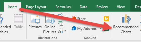
Step #1: You will first have to go to the Insert button and select Recommended Charts from the list of available options.
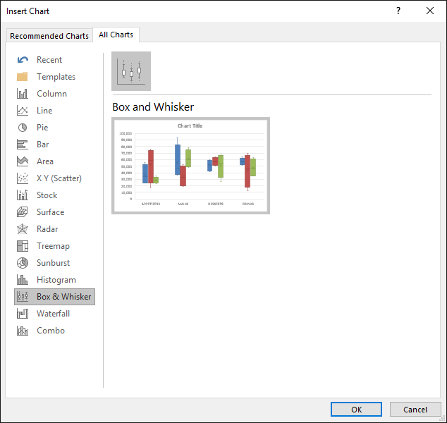
Step #2: Now, from the drop down list of Recommended Charts, you will need to select Box and Whiskers. Once you have selected the required chart, click on “ok”.
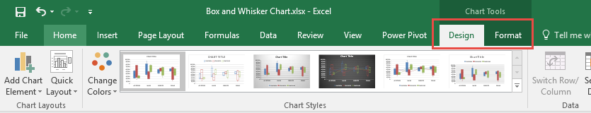
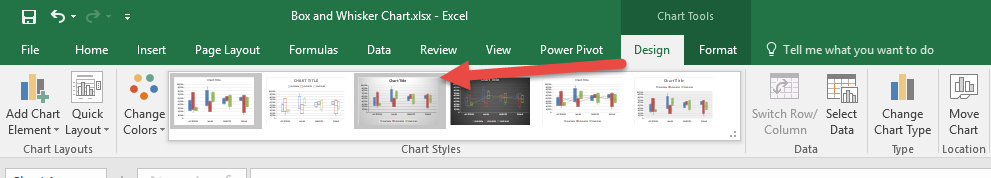
Step #3: In this step, you will customize your Box and Whiskers chart according to your needs and preferences by going to Chart Tools and selecting the desired design.
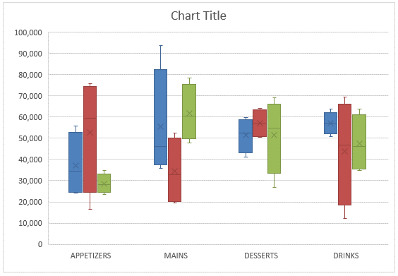
Now that your chart has been selected and designed, you can easily point out the information on the chart. Finding the outliers, mean, and median will become an easier task with the help of the Box and Whiskers chart of Excel 2016.

Related Tutorials
Microsoft Excel 2016 introduces a lot of new Charts for us to use in presentations.

IFS function is a new function added to Excel and only available in the latest version of Office (EXCEL 2016, Excel Online and latest mobile excel versions).


Latest
-
Understanding How HYPERLINK Works In Excel
Excel has a built in function to create hyperlinks &...
-
Understanding how MS Excel Query Works
“Query” in MS Excel has same meaning as ...
-
An Introduction To Excel Power Map
Our today’s post is about “Power Map&rdq...
-
Using Pivot Charts For Displaying Data
Conventional charts are mostly used for displaying r...
-
Using “Calculated Items” For Analyzing A Pivot Table
In our last post, we explored how to use calculated ...