Microsoft Excel: How To Make Step Chart

It is possible to apply step chart if you intend to monitor changes that occur at different times. This could include interest rates, tax rate, petrol and milk products. For instance, the international market and government are responsible for changing the price of fuel in countries around the world. This implies that this changes could occur at any time. While it is not possible to use a feature in Microsoft Excel to make a step chart, it is possible for the set of data to be rearranged.
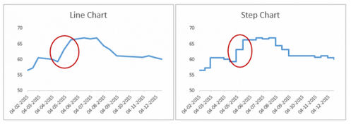
Step chart vs line chart
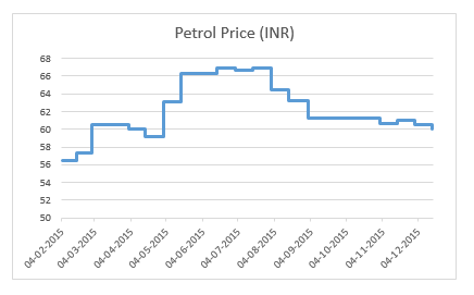
While a step chart displays the actual change time of data while also showing the trend, a line chart only links points in a data, so that a trend is observed. In the step chart therefore, the exact time when the change occurred is noticed, implying that you can see when changes were not made as well as how much change was made when they occur.
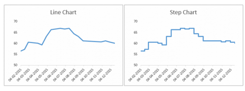
Even though both charts look alike, it is possible for some to be misled by the line chart. You could be led to feel that fuel price also increased in May and June of 2015, when in actual terms, there was no such occurrence.
How to make a step chart
PeltierTech.com’s Jon Peltier is the creator of this method. The steps for the method include:
-
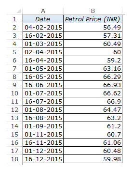
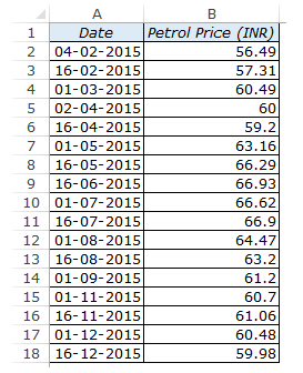
Place your data appropriately as shown below
-
Rearrange the data like this
-
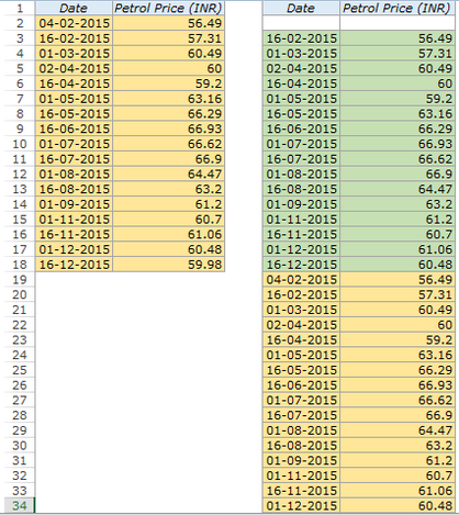
The simplest method is to make the extra set of data immediately after the main set of data. Begin in the 2nd data row and put the date reference in the original set of data’s same row. Put the value reference in the 1st data row of the main set of data and then pull the cells to the cell where the last data in the main set of data is located as shown below.
-
Get the data in the main set of data and place it under the extra set of data that was created. This would give you the result in the table below where the green shades is the data that we created while the main set of data has the orange shades. In the set of data with green shades, you will observe that an empty row was left under the title, before the values. You can decide to delete the blank row. There is also no need for the data to be sorted.
-
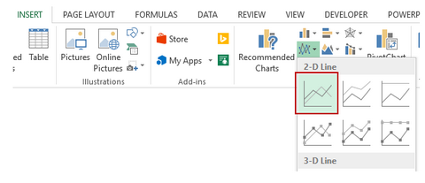
Highlight the whole set of data, from insert tab, select charts, then 2-D line chart and you will have your chart.

Related Tutorials

Do you need to create new workbooks all the time and then making similar changes to all of them?


Latest
-
Understanding How HYPERLINK Works In Excel
Excel has a built in function to create hyperlinks &...
-
Understanding how MS Excel Query Works
“Query” in MS Excel has same meaning as ...
-
An Introduction To Excel Power Map
Our today’s post is about “Power Map&rdq...
-
Using Pivot Charts For Displaying Data
Conventional charts are mostly used for displaying r...
-
Using “Calculated Items” For Analyzing A Pivot Table
In our last post, we explored how to use calculated ...